UX Projects
Pinterest Redesign
UX Case Study

As a self-taught Digital Artist, I enjoy experimenting with various media and technologies to push my creative limits. As a result, I often search for visual inspiration to find new ways to bring my ideas to life. That’s how I stumbled upon an application called Pinterest. Initially, I used it only when I wanted to discover new ideas for my designs and artworks. But every time I started browsing, I ended up exploring so much more. Fast forward to now, and I use it almost daily to create mood boards, collect images, stay up to date with design trends, learn the latest design hacks, find untried DIY crafts, and the list goes on. As a long-time pinner, I am familiar with Pinterest’s user interface. While there are lots of features I love about the app, there are some that I think could use some improvement. That’s why I chose Pinterest for my first end-to-end UX project.
About Pinterest
Pinterest is, simply put, an idea discovery platform. It is a visual search engine (and to a lesser extent a social network) comprising images, animated GIFs, and videos. The application allows us to save, sort, and share all of this information in the form of Pins and Pin Boards. Pinterest also focuses on e-commerce via ‘buyable pins’ and promoted product and brand recommendations. It has over 478 million global monthly active users as of March 2021.
According to a 2020 report, over 60% of Pinterest’s global users are women. Although men aren’t the predominant demographic, their usage increases steadily every year. Users aged 18-25 and 25-40 have both driven Pinterest’s growth. However, the number of users aged 18-25 is growing twice as fast compared to those over 25.
Disclaimer: This is my first end-to-end UX redesign project. The views presented in this case study are based solely on my personal experience with the application and the user research I conducted. Several factors impact the actual interface conception and design process. However, the ideal solutions suggested in this case study are based on the limited data I had access to and might not be entirely feasible.
Objectives
With this project, I wished to:
-
Learn how to conduct user research via user interviews
-
Analyze data to understand the challenges users face when using Pinterest
-
Brainstorm possible design solutions
-
Sketch low-fidelity prototypes and wireframe solutions using Figma
-
Learn how to create a high-fidelity interactive prototype in Figma
-
Present research findings and the redesigned interfaces with a case study
Users
User research was conducted via online interviews (calls and text messages), with follow-up discussions being carried out if and when needed. For this project, I interviewed a total of 10 Pinterest users. Out of the 10 total users, 50% were female, and 50% were male. 70% of users belonged to the 18-25 age bracket, while 30% were above the age of 25. 70% of users used the application multiple times a week, whereas 30% used it at least once a week.
According to the users, the following were their most popular reasons for using Pinterest:
-
Search and download images
-
Look for inspiration for social media posts and designs/artworks
-
Find DIY craft and decor ideas
And these were their most-used features:
-
Save Pins
-
Download images
-
Explore/browse
The following were the things they liked most about Pinterest:
1. You can find exactly what you need
2. It provides a wide and less generic pool of images and ideas
3. Lots of great content to explore
Note: I also went through the Google Playstore reviews for Pinterest to get a better understanding of the problems that users face on a wider scale.
Interface 1: Home Page
Pinterest’s landing page is the home feed: a collection of all the things you like in one place. Aesthetically the page is beautiful, and users are fond of the feed layout. It’s easy to navigate, and the posts update intuitively. However, there are two main problems with this interface:

Problem 1: No Filter
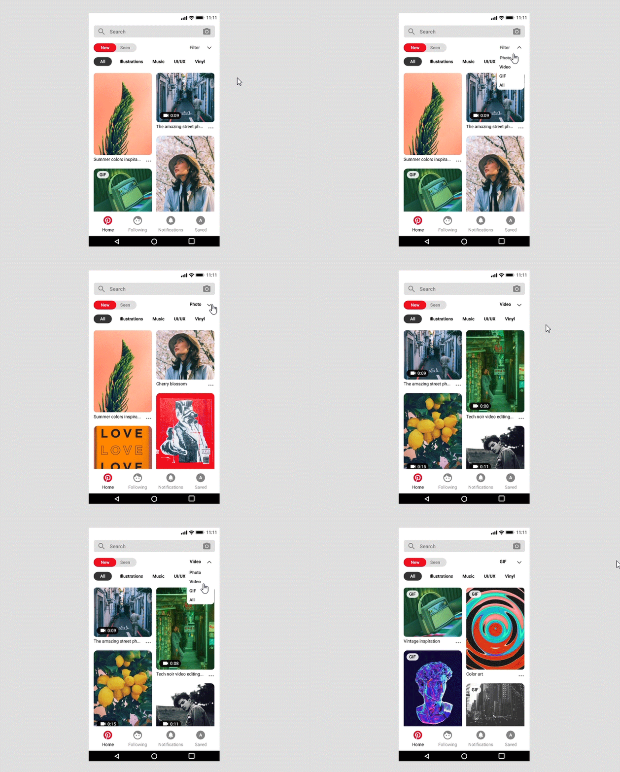
One major problem is that when users search for images, they often find too many (promoted or otherwise) videos taking up space on the feed. Another similar issue is when they are looking for animated GIFs, they have to scroll through dozens of images and videos.
There are multiple ways to solve this problem. For instance, you can make separate pages for different types of pins. However, I do not think this would be the most efficient solution as it would take the users a long time to find what they are looking for as these pages would still present a collective mixture of pins based on all their interests. Also, I quite like how Pinterest currently has distinct pages set up based on our favorite boards. They make looking for new pins related to topics I frequently search for much easier. For the solution, I took inspiration from a similar website named Tumblr. One of the features I like about Tumblr that makes my searching experience better is the “Filter by Post Type” option. I added a “Filter” drop-down to Pinterest below the search bar and above the boards' panel to the right. With this drop-down, users can navigate the feed as usual while having the option to filter the pins according to their type.

Problem 2: FOMO
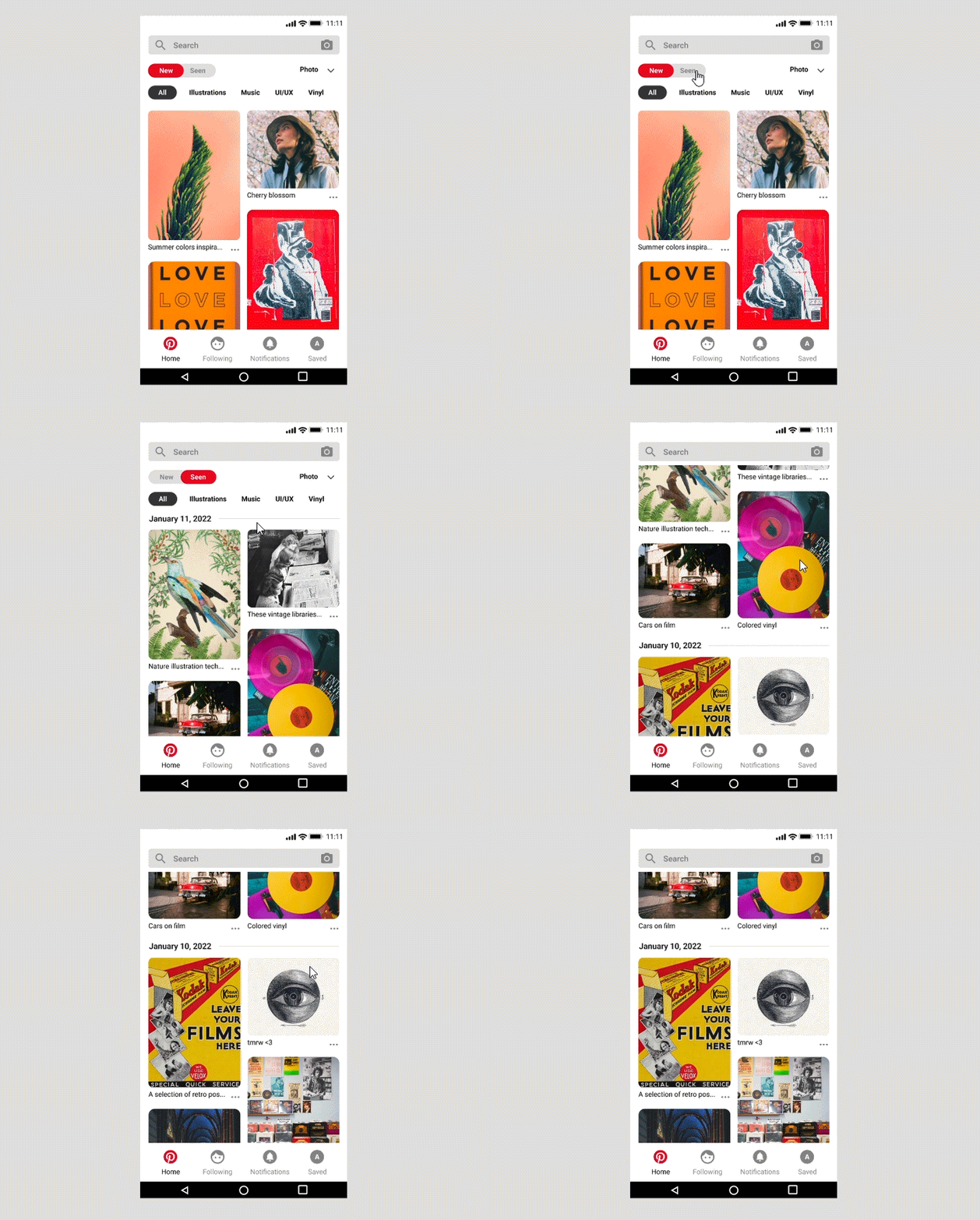
Another issue users widely face is missing out on pins they saw but didn’t save. Pins update quite fast on the app, which is good as it provides the users with a variety of fresh content. On the other hand, going back to something you might have seen a few days ago but didn’t save is not an easy task. There might be some back-end data management constraints that would make implementing a solution to this problem quite a challenge. But, if possible, I would add an option to sort pins by time. A “Sort” dropdown wouldn’t make much sense for only one type of sorting as it would just add an extra step. So, I added a “New/Seen” button on the left of the “Filter” dropdown. With this, users can easily click on “Seen” to switch to a view that arranges pins according to the date on which they appeared.

Interface 2: Download
90% of the users I interviewed said one of the tasks they perform most frequently is downloading images. However, 60% of the users said figuring out how to download images was the task that took them the longest time. You have to click on any pin you wish to download to open it. Then even on the pin page, there is no direct download button. You have to click on the vague “…” more options button to find an option to download the image. In recent updates, the “…” button is present in the feed below each pin so you don’t need to open the pin page to access the download button. However, it is still not easy to figure out how to carry out a task that a vast majority of the users regularly perform.

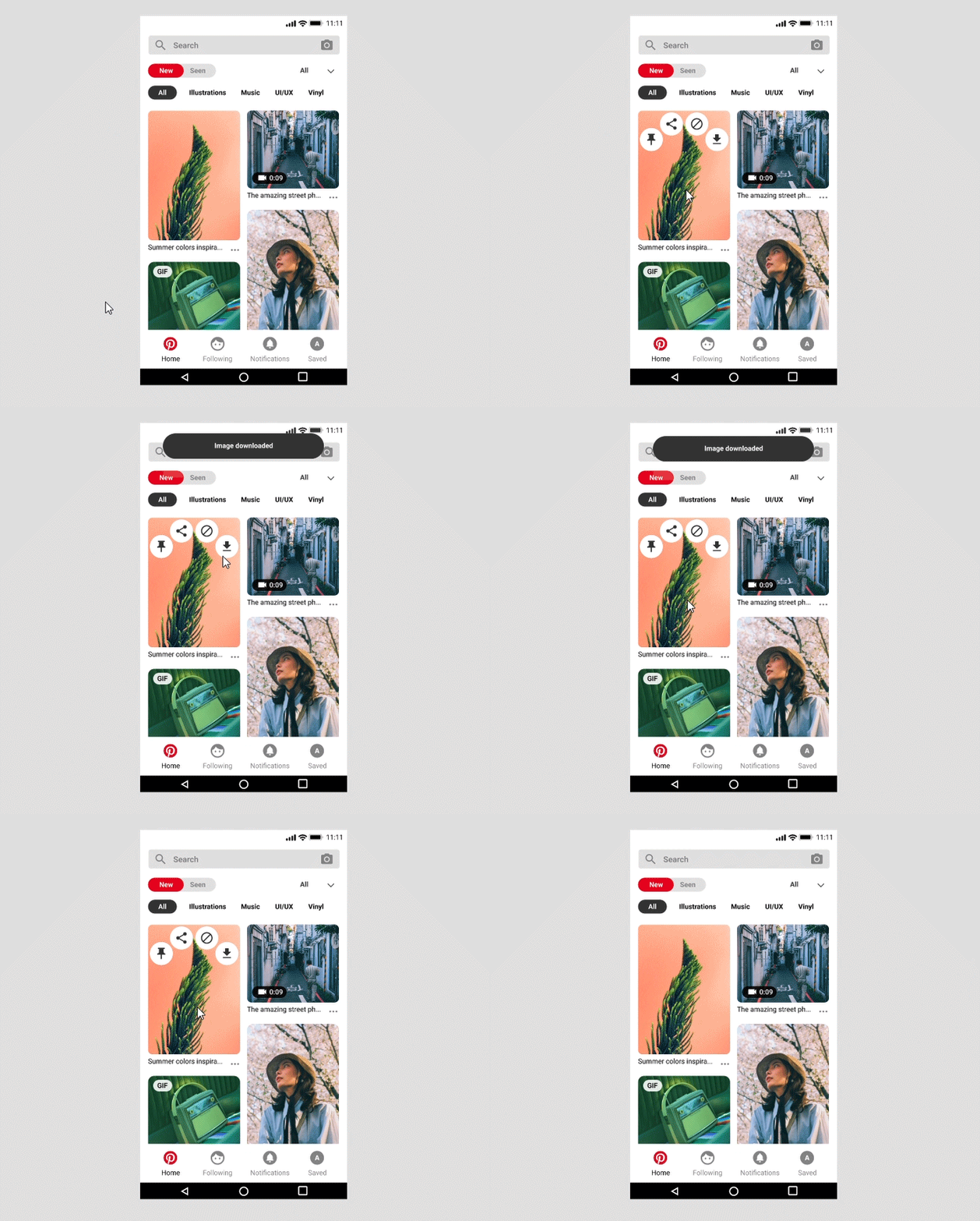
One of the best features of the current Pinterest design is the pin long-press menu. You can press any pin on the feed for a second to access multiple options such as Save (to board), Hide and Share easily. These options are self-explanatory icons that show good use of accordance. So, I just added a download file icon to this menu. With this, users can perform the download task in just one step while the familiar icon makes it easy to figure out its function.

Interface 3: Save to Board
The ‘Save’ interface is the app’s most used feature. You can use it to save a particular pin to a board of your choice or the subsection of any board. You can do so using the pin long-press menu or by clicking on the pin and pressing the “Save” button. Both of these interfaces are easy to use and easy to learn.
Most users create multiple boards based on their different interests. The problem arises when choosing one of these boards to save a pin. While using the save function, Pinterest’s current design shows you a “Top Choices” section of boards. This section includes the top three boards Pinterest thinks are the most relevant for the pin. While this is a good idea to make the application more intuitive, it is rarely accurate. In any case, you have a list of all boards arranged alphabetically below this section that you have to scroll through to find the desired one. This might not be a big problem for casual users, but for regular users like myself, it is often very time-consuming and off-putting to scroll through tens of boards each time to save one pin.

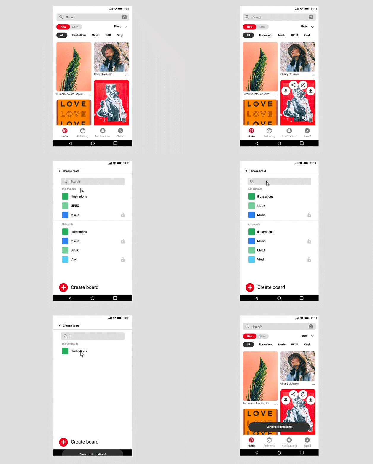
To solve this problem, I added a search bar at the top of the board selection interface. Did your board show up in the “Top Choices” section? Great. If not, you can type the first few letters of its name to find it easily.

Conclusion
Human-Computer Interaction (HCI) and User Experience (UX) Design have fascinated me since the last semester of my undergraduate course. With this project, I wanted to get an idea of a career in the field of UX. I applied the skills I had learned so far while taking on new roles and learning new concepts such as User Research and Data Analysis. As a visual designer, I imagined conducting user research would be the hardest part. However, it turned out to be an enjoyable and insightful experience. Understanding users truly helped lead the project in a meaningful direction. Initially, there were multiple instances where I had to scrap everything and begin again from scratch. While it seemed challenging, it eventually made me more efficient, and I started thinking one step ahead. In doing so, I accomplished the objectives I set out for my first UX project. The experience just made me more excited to dive deeper into the world of UX and HCI.